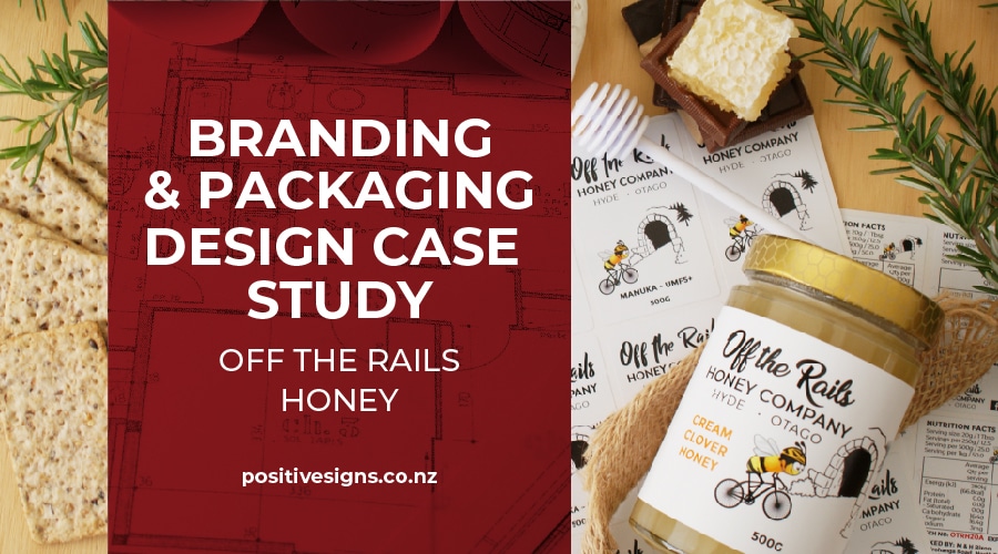
A lot of clients know that we do signage, and digital printing, but don't realise the extent of everything we offer. So today I thought I'd write a case study on the branding and packaging design we have done for one of our clients: Off the Rails Honey.
 Based just off the Central Otago Rail Trail and with hives throughout the area, Quentin came to us looking for a logo design that incorporated a bee on a bike and the Hyde Rail Tunnel.
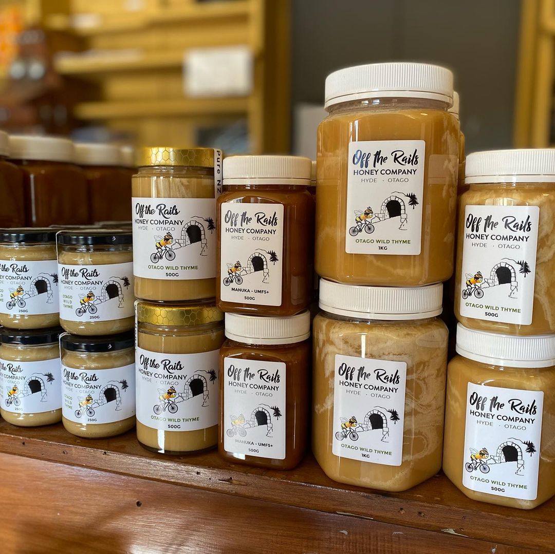
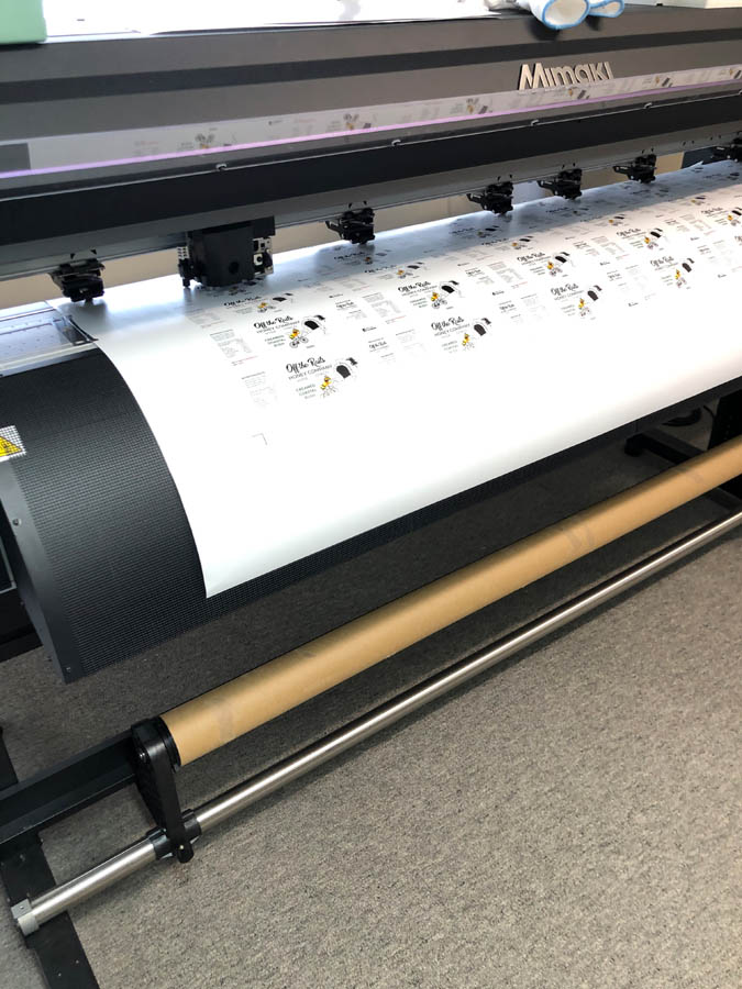
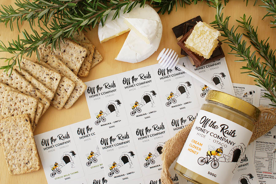
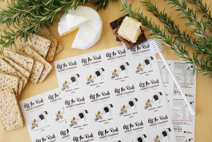
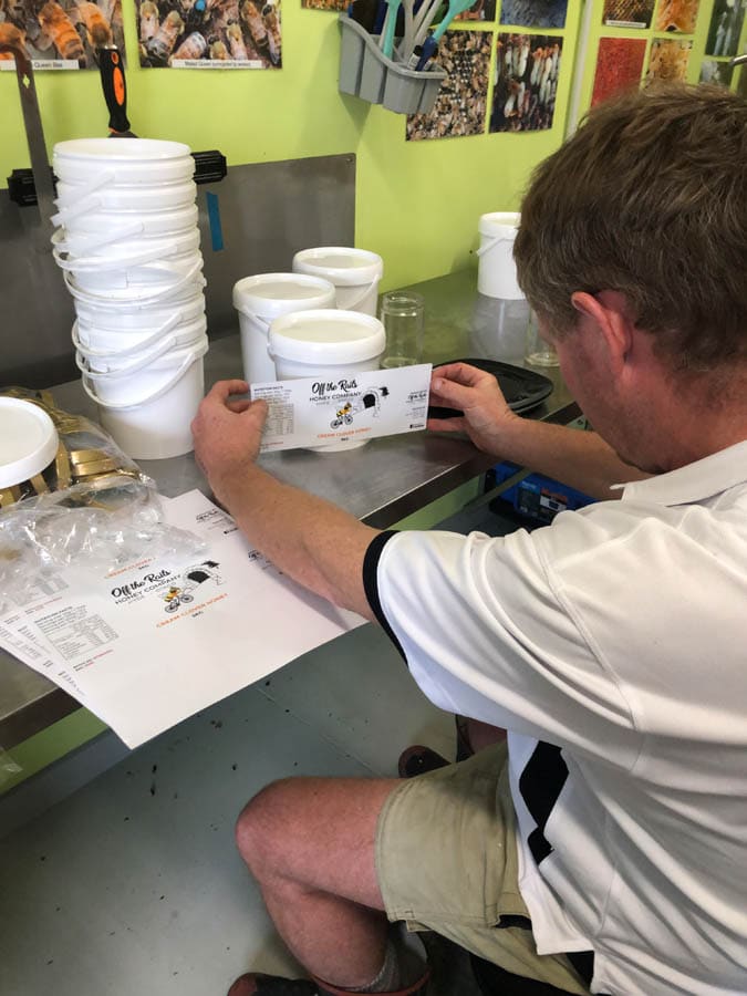 To keep ordering straight forward for him, we've set up his labels onto A4 sheets, aka as our Packaging Stickers. Each label on those sheets are produced to the size required for the jar they are going on - so some sheets have more labels, some have less. Just depends on the final size required - we've got the ability to change it up to suit.
 From this initial design, we produced packaging labels to suit the different sized jars and products Off the Rails produced. Quentin has done some testing to see what jars and labels are most popular, so printing short runs of packaging labels initially has worked well for this.
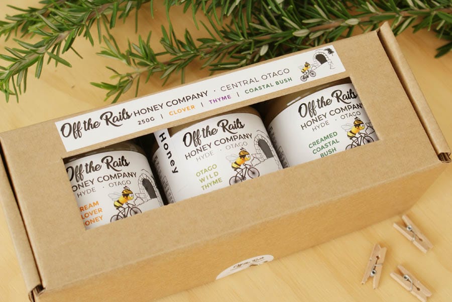
 As his honey production ramps up, Quentin has added more varieties to his range, and has had success with his gift boxes:
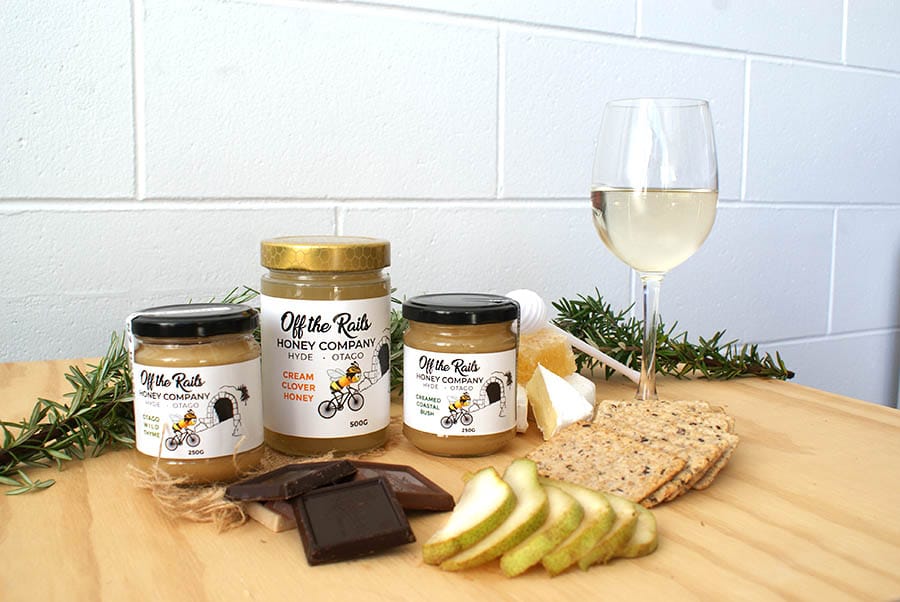
 The end goal with any of our design is to produce something that's consistent with the client's brand - so they can be recognised individually or work well together.
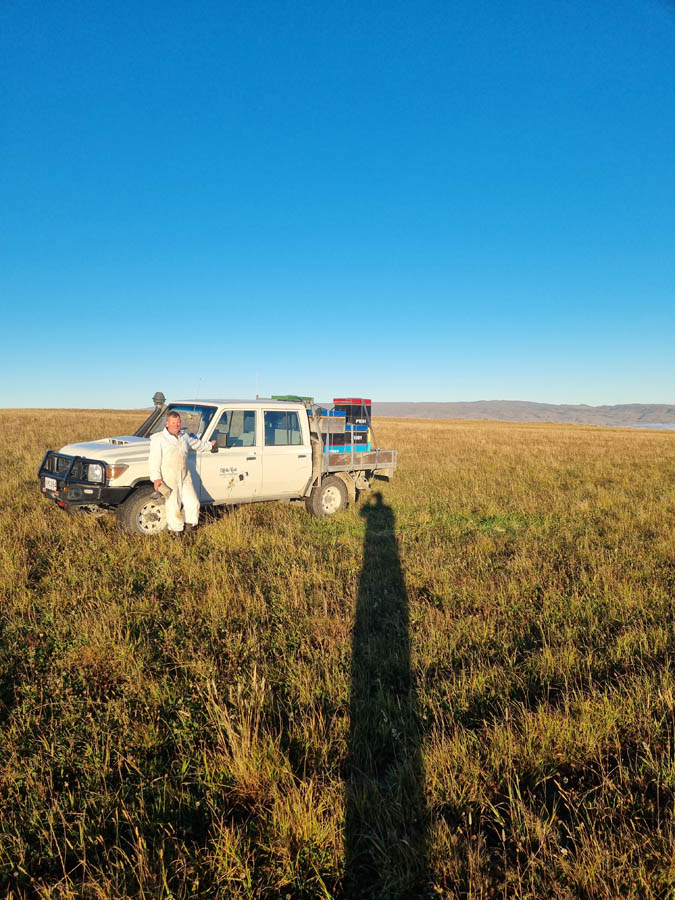
 As well as branding his actual product, we've signwritten Quentin's truck and done a run of pens to get his brand out there in a consistent way.
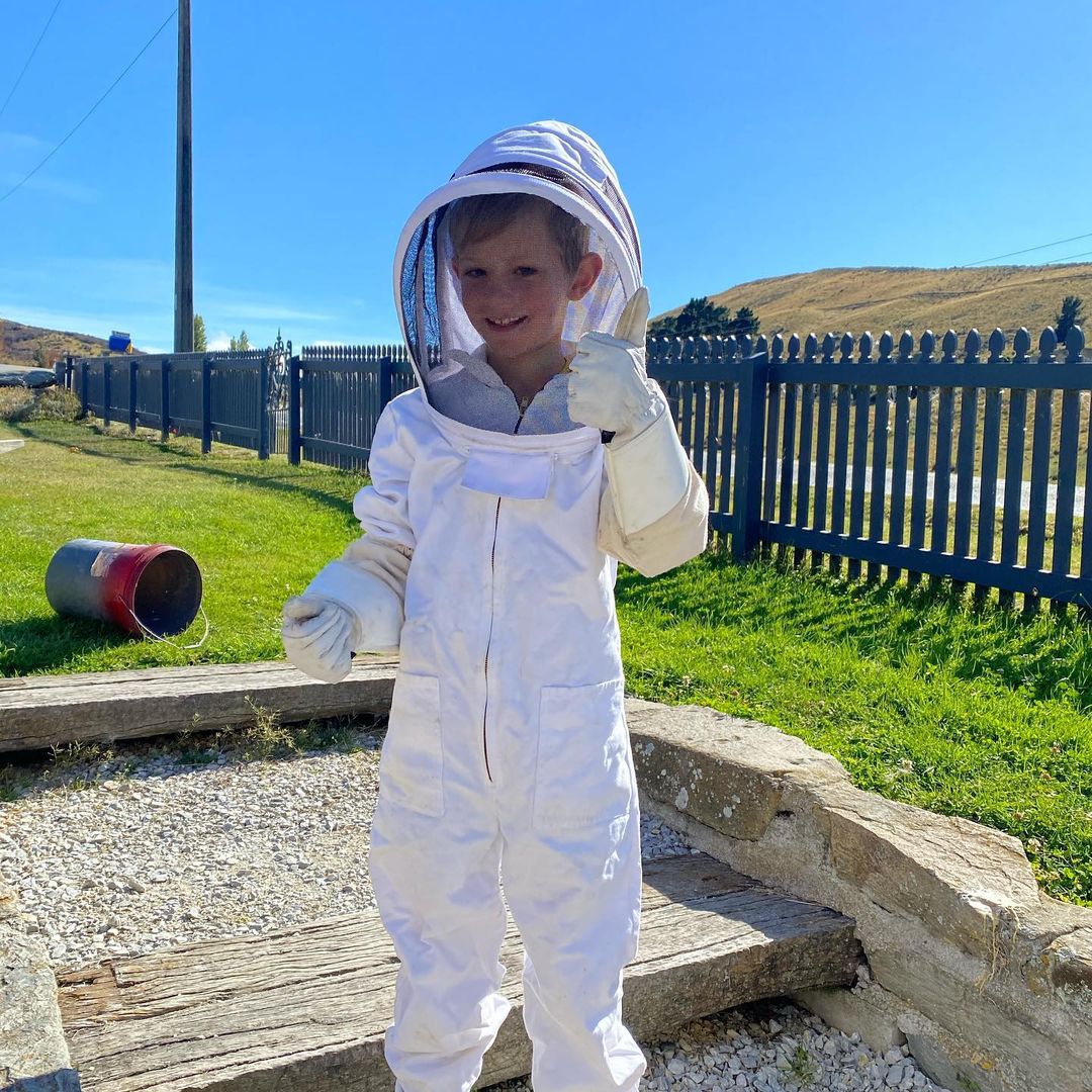
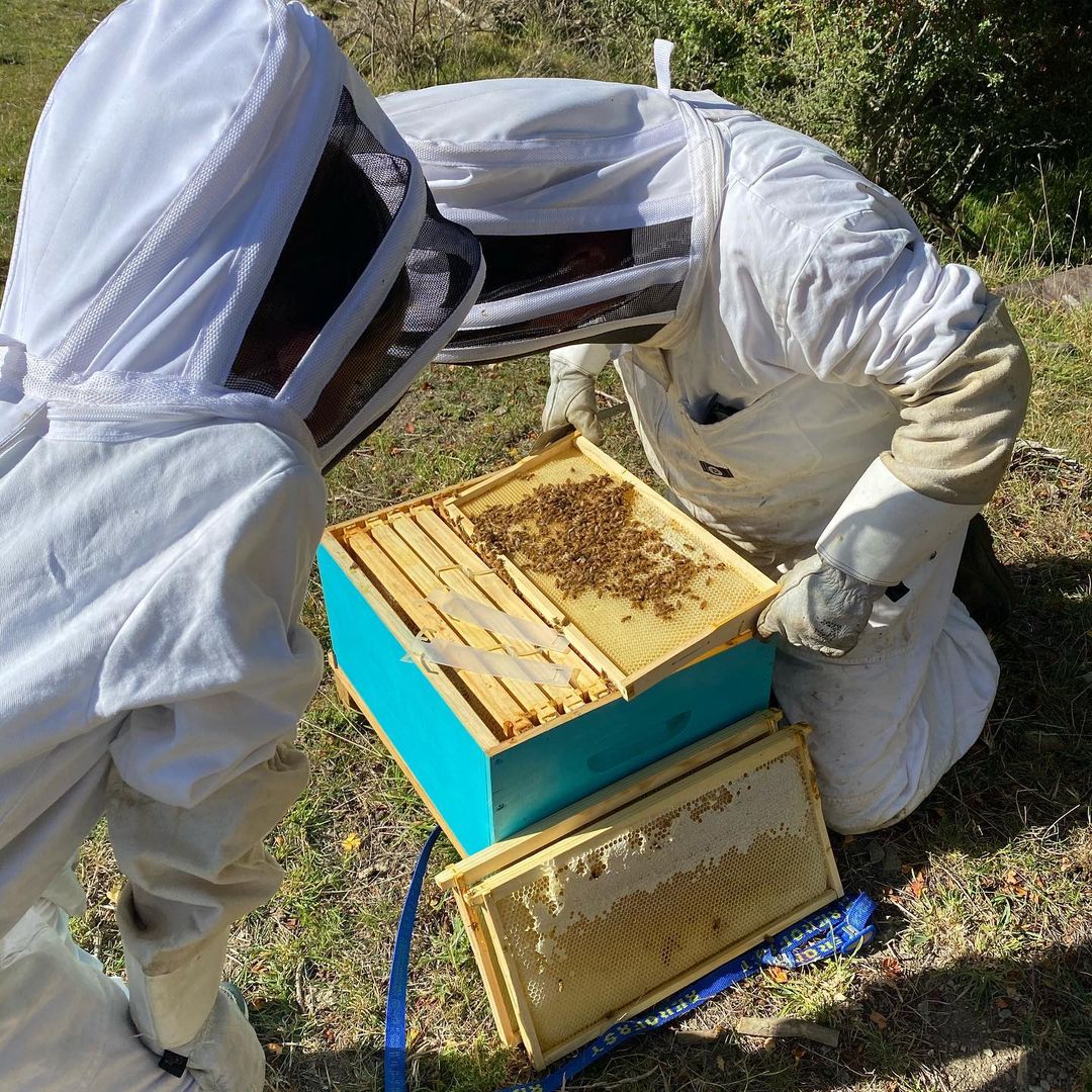
 We've been lucky enough to get a first hand tour around the hives and the honey collection process:
 If you produce honey, or other food items, get in contact and see how we can help!

Based just off the Central Otago Rail Trail and with hives throughout the area, Quentin came to us looking for a logo design that incorporated a bee on a bike and the Hyde Rail Tunnel.
To keep ordering straight forward for him, we've set up his labels onto A4 sheets, aka as our Packaging Stickers. Each label on those sheets are produced to the size required for the jar they are going on - so some sheets have more labels, some have less. Just depends on the final size required - we've got the ability to change it up to suit.
From this initial design, we produced packaging labels to suit the different sized jars and products Off the Rails produced. Quentin has done some testing to see what jars and labels are most popular, so printing short runs of packaging labels initially has worked well for this.
As his honey production ramps up, Quentin has added more varieties to his range, and has had success with his gift boxes:
The end goal with any of our design is to produce something that's consistent with the client's brand - so they can be recognised individually or work well together.
As well as branding his actual product, we've signwritten Quentin's truck and done a run of pens to get his brand out there in a consistent way.
View this post on Instagram
We've been lucky enough to get a first hand tour around the hives and the honey collection process:
If you produce honey, or other food items, get in contact and see how we can help!